CASE STUDY · WEB DESIGN & DEVELOPMENT
Sula Bozis
A digital upgrade for a researcher of the Greek East, with forty years of writing on gastronomy, weaving and the memory of the Rum of Istanbul.
THE SITE
Every page distinct, one body together
No page repeats the one before it. What holds them together is the same typography, the same palette and the same rhythm, not a shared template.
- i.A homepage built around an 1837 engraving
- ii.A library, with a page for every title
- iii.An article calendar by year
- iv.Search as an index
- v.The shelf above the footer
THE IDEA
We didn’t start from a template. Each page got a name first (Engraving, Shelf, Calendar, Index) and was then designed around it. The names kept the whole together without flattening it.
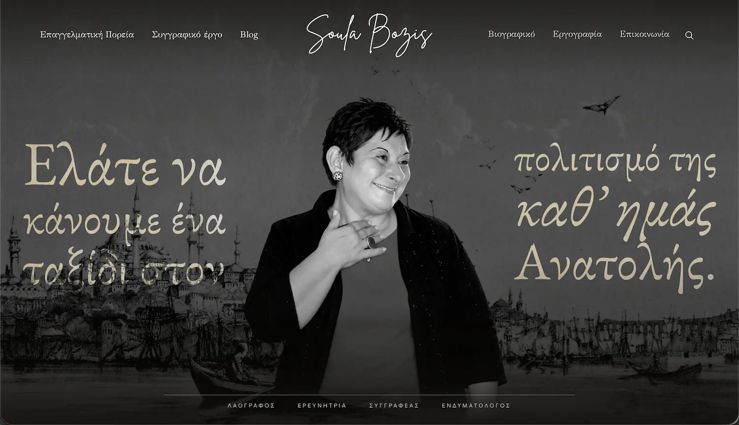
Homepage
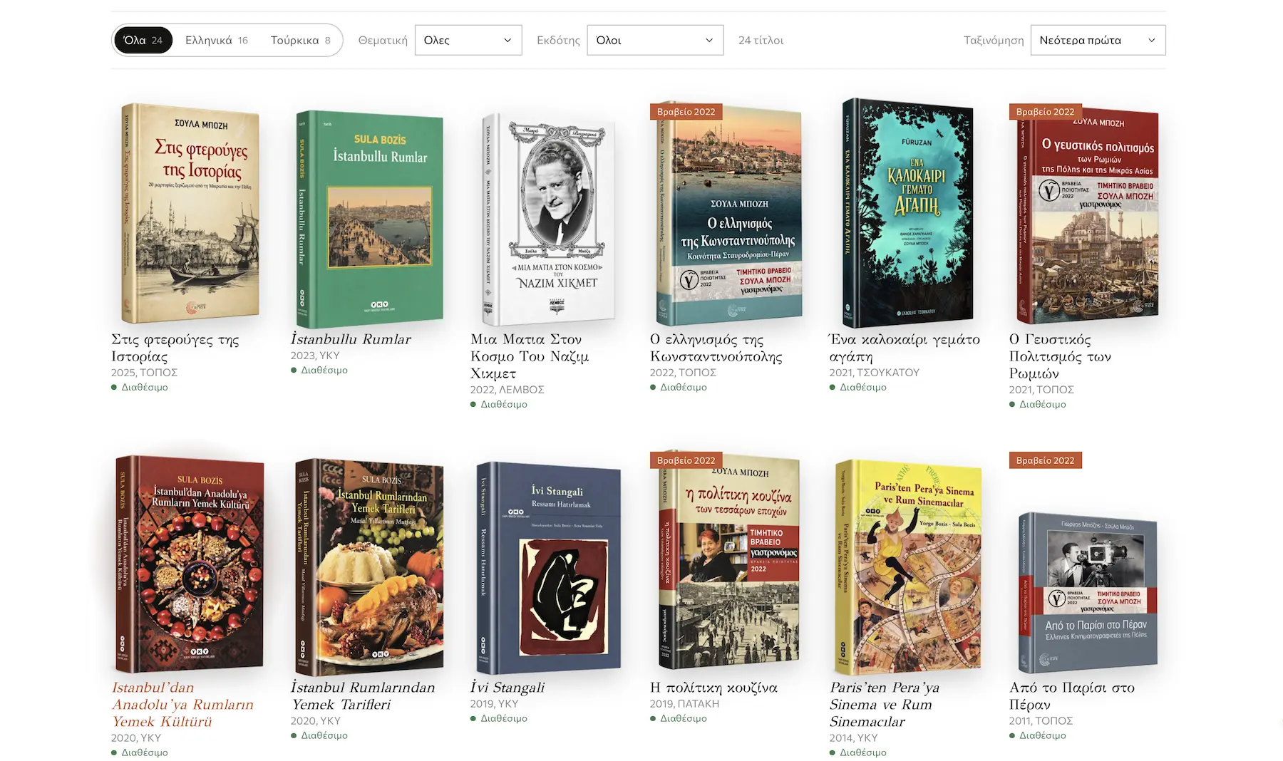
Library
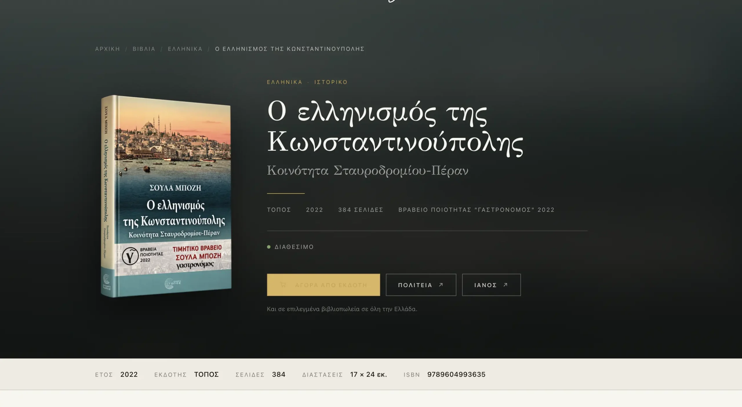
Book page
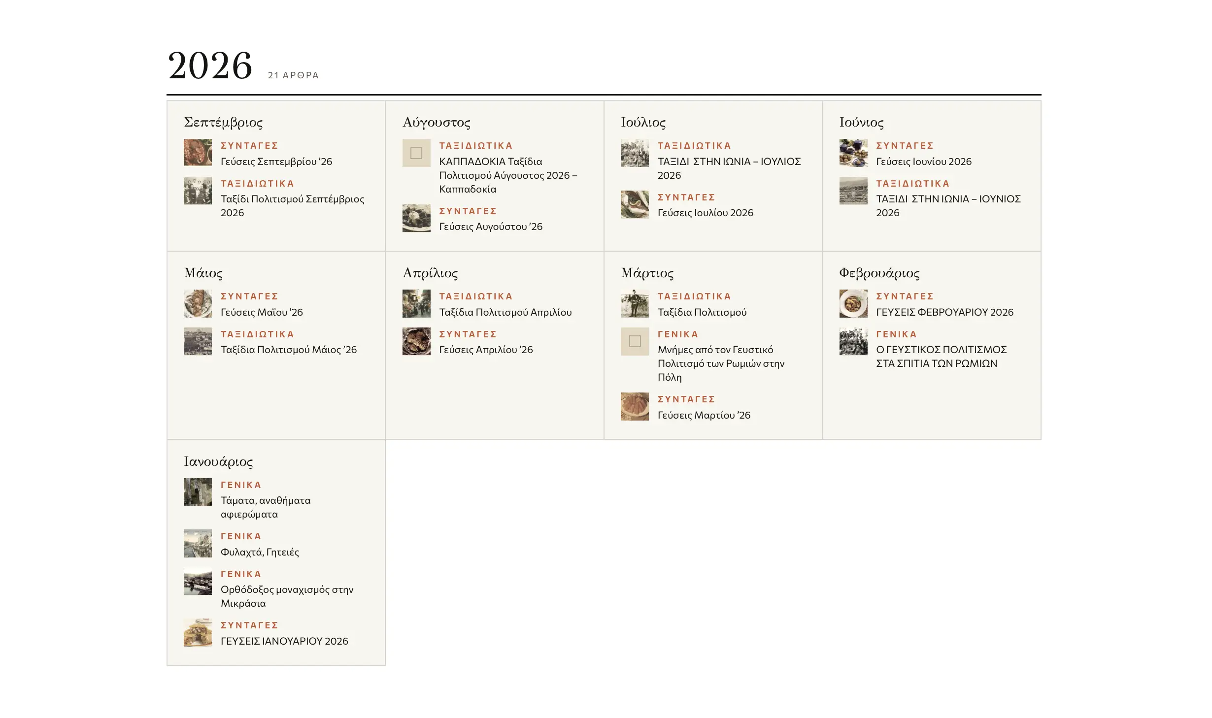
Calendar

Search
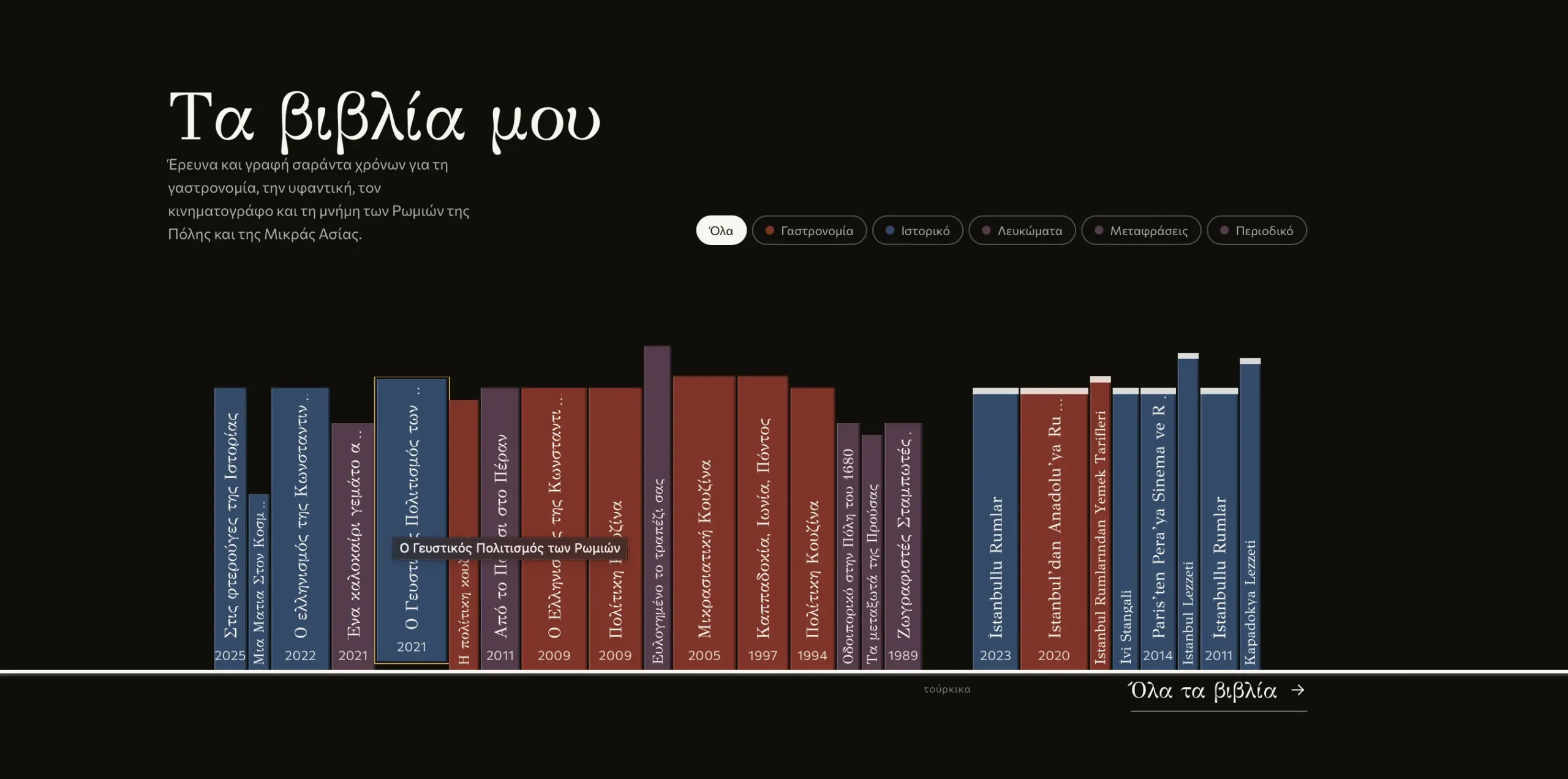
The shelf
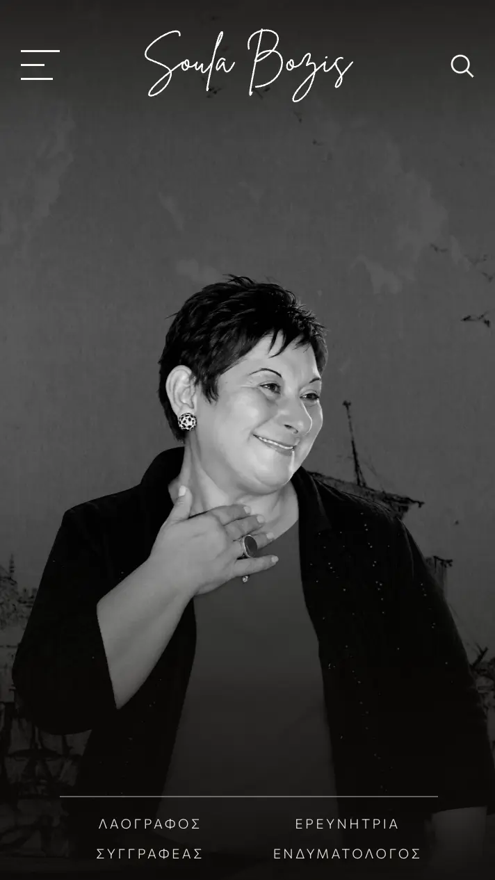
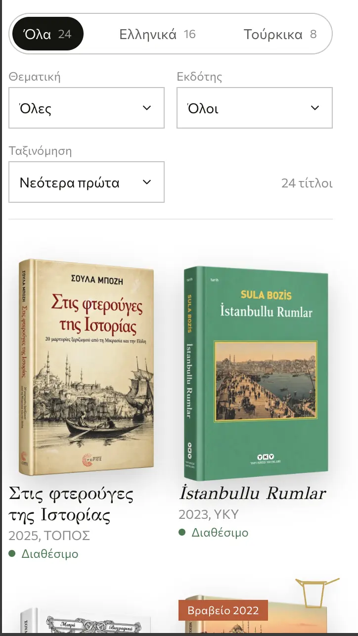
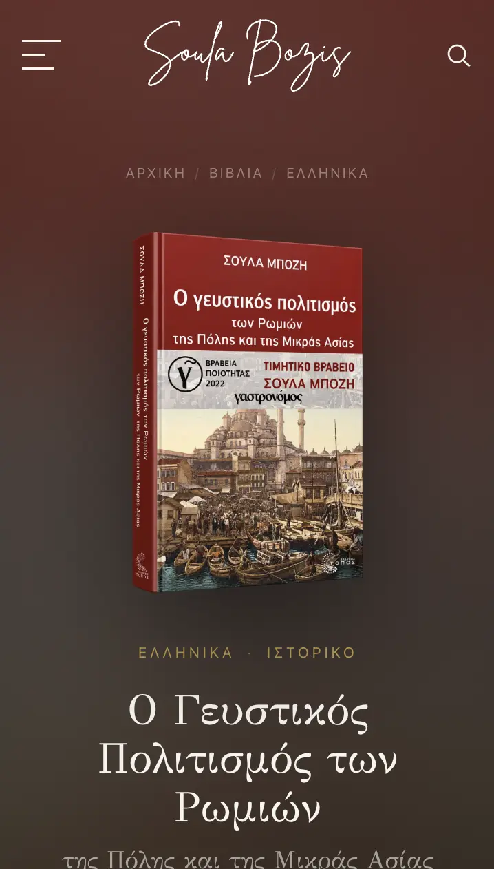
The same language at 390px
HOMEPAGE
The 1837 engraving inside the letters
Her portrait sits fully transparent over the entrance to the Golden Horn. The phrase adapts to the screen width and the engraving shows through the typography.
- i.Engraving by John Frederick Lewis, 1837
- ii.Transparent header over the image
- iii.Live search inside the menu
- iv.The subtitle is recalculated at every resolution
- v.Reading order that works for search engines and mobile
THE IDEA
She says “come, let’s take a journey”. We wanted visitors to literally step into the landscape she writes about. That’s why the 1837 engraving doesn’t sit behind the letters, it shows through them.
LIBRARY
A body of work in one archive
Twenty-four titles, sixteen in Greek and eight in Turkish. Every book gets its own record, with subject and publisher, and visitors filter without a page reload.
- i.Custom post type for the books
- ii.Filtering by language, subject and publisher
- iii.Sorting by year, with a title count
- iv.Covers as transparent cut-outs, no frames
- v.Award and availability badges on every cover
THE IDEA
Publisher catalogues show covers as rectangles in a grid. We cut them from their backgrounds and stood them upright, the way you’d see them on a bookshop table.
BOOK PAGE
Every title takes on the colour of its cover
The page isn’t a form to fill in: the cover sets its background. Next to it sit the edition details and the links to find a copy.
- i.The dominant colour is read from the cover
- ii.Publisher, year and page count below the subtitle
- iii.Buy from the publisher, Politeia or Ianos
- iv.Real-time availability
- v.Breadcrumbs: Home, Books, language, title
THE IDEA
Twenty-four books, twenty-four different aesthetics. Instead of putting them all in the same suit, we let each cover dress its own page, the way a jacket dresses a book.
THE SHELF
Above the footer, the complete bibliography
The last section of the homepage is a shelf holding the spines of every book. Height and thickness come from the edition, colour from the subject.
- i.Every title’s spine in a single row
- ii.Height and thickness true to each edition
- iii.Colour by subject: gastronomy, history, photo books
- iv.Subject filters and a link to all books
- v.Greek and Turkish titles in two sections
THE IDEA
On a bookcase you don’t see covers, you see spines. We wanted the homepage’s final image to be exactly that: forty years of work in a single row, each at its true height.
CALENDAR
Every year opens into twelve months
Each year opens into months, and each month holds its articles with a thumbnail and category. The archive reads like a calendar, not a list.
- i.Each year’s months in a grid, with an article count
- ii.Filtering by category, with counts per year
- iii.Horizontal scrolling on mobile
- iv.Articles with an engraving and a sheet of paper on top
- v.Structure for texts that arrived without headings
THE IDEA
Her articles are called “June Flavours” and “Culture Journeys, May”. It was already a calendar, the usual blog feed just didn’t show it.
SEARCH
The search term as a dictionary entry
Search doesn’t return a list, it compiles an index. It also looks inside the body of every text, so even a spice buried in a recipe gets found.
- i.Grouped by type (articles, career, pages) with counts
- ii.Month and year in a column, with dotted leaders
- iii.“ανατολη” finds “Ανατολή”: accents are ignored
- iv.An excerpt with the term in bold
- v.“Did you mean” that checks the suggestion actually exists
THE IDEA
A folklorist’s archive reads like a dictionary: you look up a word and find where it appeared. So the search term is set as a headword, with the results indexed below it.
DESIGN SYSTEM
Old paper, gold, cinnabar
The sources are declared: the dark of old paper, the gold of manuscripts, the red of seals. Nothing decorative.
NEXT STEP
Let’s talk about your project
If your site doesn’t reflect what you do, we know how to change that.
START A PROJECT